


Posted By

With the increasing complexity in the front-end arena, from being bound to make UIs responsive and browsers compatible to ease the performance, accessibility, and async states, it is often a hassle to manage it all. In these situations, frameworks like React, Angular, and Vue come to the rescue, helping break down UIs into simple components and improving the situation for developers. Yet, they do not solve all the issues, as when the front-end expands, the count of components to keep track of also grows, making debugging complex, as they are equipped with interactive states, app context, and business logic. The solution is to segregate the UI into components and capture those components as stories, which is achieved using Storybook.
What is Storybook?
Storybook is a JavaScript-based utility that facilitates the development of systematic User Interface (UI) frameworks. It streamlines the process of developing and documenting applications while simultaneously enhancing their overall efficiency and usability. The component's superpower is not firing up the whole application to see if it's working; but displays the functionality of the event with only a few props or events. Storybook is packaged as a compact, development-centric environment that coexists alongside our application, offering an isolated iframe to exhibit components without the influence of app-specific business logic and contextual factors. This feature enables developers to concentrate on the various iterations of each component, including the more intricate and inaccessible edge scenarios. Stories are a declarative syntax that provides props and mock data to replicate diverse component variations. These stories can be applied to multiple components, with each individual story facilitating a unique demonstration of a particular component iteration, allowing developers to validate its visual and functional attributes. To summarize, Storybook is a UI directory where all default components with props can be created to be used throughout the project.
Workflow of Storybook:
- Build reusable components and write stories for their units of variations
- Enable complex functionality by creating small components
- Assemble pages by combining composite components
- Integrate the pages into your project
Benefits:
- Durability
- Reusability
- Easier to test
- UI workflows automation
The intersection of design and development is essential to any product development. Engineers need a mechanism to comprehend and convert a design into code when it's prepared to enter the development phase. Here Zeplin comes into the picture. Zeplin provides an accessible workspace that is friendly to developers and provides finalized designs, organized screens, reusable components, style guides, and much more.
As stated earlier, Storybook enhances and eases UI development. It makes development rapid and easier by isolating components. This allows developers to work on one component at a time. Entire UIs can be developed without needing to start up a complex dev stack, force certain data into your database, or navigate around your application. Storybook also has an ecosystem of add-ons to help developers customize or extend Storybook to suit their needs.
Zeplin and Storybook are two tools that are widely used. Zeplin has introduced a new add-on for Storybook, which aids developers in scrutinizing the accuracy of their apps in one easy workflow. Developers can now compare the visual accuracy of components in Zeplin with their code counterparts in Storybook, all in real time and in one place. It has an add-on panel to get a side-by-side comparison between the two components.
Connecting Zeplin to Storybook for React
Pre-requisites:
1. Node (>=14.0.0)
2. Npm (>=5.6v)
Installations:
-
Node and npm can be installed from Node/npm Installations
-
Follow the steps to connect Zeplin and Storybook:
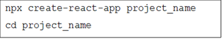
- Create your React app using the following:
-
Initialize the Storybook using the following:

Now, install the Storybook add-on that embeds Zeplin resources in the add-on panel using the following:

Register the add-on in main.js in the .storybook folder:

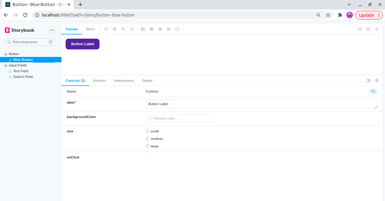
Now create components for the Storybook:
Here, create three components - one button and two input fields. Below is the code of the story, the component, and the CSS applied to it. These three components will be visible in the Storybook.
import React from 'react';
import { Button } from './Button';

export default {
  title: 'Button',
  component: Button,
  argTypes: {
    backgroundColor: { control: 'color' },
  },
};

const Template = (args) => <Button {...args} />;

export const blueButton = Template.bind({});
  blueButton.args = {
    label: 'Button Label',
};
}
import React from 'react';
import PropTypes from 'prop-types';
import './button.css';

export const Button = ({ primary, backgroundColor, size, label, ...props }) => {
  return (
    <button
       type="button"
       className={['storybook-button', `storybook-button-   -${size}`].join(' ')}
       style={backgroundColor && { backgroundColor }}
       {...props}
    >
     {label}
    </button>
  );
};

Button.propTypes = {
  backgroundColor: PropTypes.string,
  size: PropTypes.oneOf(['small', 'medium', 'large']),
  label: PropTypes.string.isRequired,
  onClick: PropTypes.func,
};

Button.defaultProps = {
  backgroundColor: null,
  size: 'medium',
  onClick: undefined,
};
.storybook-button {
   font-family: 'Nunito Sans', 'Helvetica Neue', Helvetica, Arial,      sans-serif;
   font-weight: 700;
   border: 0;
   border-radius: 10px;
   cursor: pointer;
   display: inline-block;
   line-height: 1;
   color: white;
   background-color: #4745a5;
   height: 40px;
   padding: 9px 32px;
}
.storybook-button:hover{
   background-color: #7d89b4;
}
.storybook-button:disabled{
   background-color: #b7c2ec;
}
.storybook-button--small {
   font-size: 12px;
   padding: 10px 16px;
}
.storybook-button--medium {
   font-size: 14px;
   padding: 11px 20px;
}
.storybook-button--large {
   font-size: 16px;
   padding: 12px 24px;
}
import React from 'react';
import { Input } from './Input';

export default {
  title: 'Input Fields',
  component: Input,
};

const Template = (args) => <Input {...args}/>;

export const textField = Template.bind({});
  textField.args = {
  type: "text",
  name:"textInput"
}
import React from 'react';
import PropTypes from 'prop-types';
import './input.css';

export const Input = ({ type, name, className, placeholder, required, disabled, onChange, onBlur, minLength, maxLength, value, ...props}) => {

return(
  <>
   <input
      type={type}
      name={name}
      id={name}
      className={`inputField ${className}`}
      placeholder={placeholder}
      required={required}
      disabled={disabled}
      onChange={onChange}
      onBlur={onBlur}
      minLength={minLength || undefined}
      maxLength={maxLength || undefined}
      value={value}
      {...props}
    />
  </>
);
};

Input.propTypes = {
  name: PropTypes.string.isRequired,
  type: PropTypes.string.isRequired,
  className: PropTypes.string,
  placeholder: PropTypes.string,
  required:PropTypes.bool,
  disabled: PropTypes.bool,
  onChange:PropTypes.func,
  onBlur:PropTypes.func,
  minLength: PropTypes.number,
  maxLength: PropTypes.number,
  value: PropTypes.string
}

Input.defaultProps = {
  type:"text",
  name: null,
  className:null,
  placeholder: "Input Here",
  required: false,
  disabled: false,
  onChange: undefined,
  onBlur: undefined,
  minLength: null,
  maxLength: null,
  value: null
}
.inputField{
   height: 45px;
   line-height: 45px;
   background: white;
   border: 1px solid black;
   font-size: 0.9em;
   color: black;
   padding: 0.375rem 0.75rem;
   display: block;
   box-sizing: border-box;
   outline: none;
   border-radius: 6px;
}

.inputField:disabled{
   background-color: azure;
}
import React from 'react';
import { SearchInput } from './SearchInput';

export default {
  title: 'Input Fields',
  component: SearchInput,
};

const Template = (args) => <SearchInput {...args}/>;

export const searchField = Template.bind({});
  searchField.args = {
  name:"searchInput"
}
import React from 'react';
import PropTypes from 'prop-types';
import './searchInput.css';
import searchIcon from '../Images/ic-search.svg';

export const SearchInput = ({ name, className, placeholder, required, disabled, onChange, onBlur, value, ...props}) => {

return(
  <div className="input-container">
   <input
      type="text"
      name={name}
      id={name}
      className={`search-field ${className}`}
      placeholder={placeholder}
      required={required}
      disabled={disabled}
      onChange={onChange}
      onBlur={onBlur}
      value={value}
      {...props}
   />
   <img class="search-icon" src={searchIcon}></img>
  </div>
);
};

SearchInput.propTypes = {
  name: PropTypes.string.isRequired,
  className: PropTypes.string,
  placeholder: PropTypes.string,
  required:PropTypes.bool,
  disabled: PropTypes.bool,
  onChange:PropTypes.func,
  onBlur:PropTypes.func,
  value: PropTypes.string
}

SearchInput.defaultProps = {
  type:"text",
  name: null,
  className:null,
  placeholder: "Search Here...",
  required: false,
  disabled: false,
  onChange: undefined,
  onBlur: undefined,
  value: null
}
.search-field{
   height: 45px;
   line-height: 45px;
   background: white;
   border: 0px solid black;
   font-size: 0.9em;
   color: black;
   padding: 0.375rem 0.75rem;
   display: block;
   box-sizing: border-box;
   outline: none;
}
 .input-container{
   width: 300px;
   height: 45px;
   border-radius: 4px;
   border: 3px solid black;
   display: flex;
   justify-content: space-around;
}
.search-icon{
   margin: auto 0;
}
 .inputField:disabled{
   background-color: azure;
}
Once the code is ready, run the following command:
The components will be accessible in Storybook. Once the components are accessible, connect them to Zeplin.


- To access Zeplin resources, you need to provide an access token with your Zeplin account permissions. The Zeplin add-on of Storybook will help you set the token. This token is kept in the browser storage. An access token can be set in the following ways:
- Click on Developer (highlighted in blue):
- Create a new token once you are navigated to the developer tab

Copy the token and paste it into the Personal Access Token field, and hit ‘save’

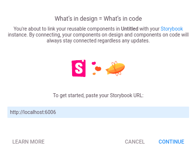
- Now head back to the Zeplin dashboard, where you can see the integrations sections on the right panel. Choose Storybook, and when the modal appears, enter the URL of your Storybook instance, and connect it with Zeplin.

-
Once the Storybook is connected, you will see all the stories of Storybook instance on the left side and Zeplin components suggestions that match with stories on the right. Here you can approve to link the stories or unlink the connected stories and even select from all the components to link the stories.


And voila, now Storybook is connected to Zeplin components, and you can see the codes whenever any component is selected in Zeplin. You can compare the resemblance of your component with the Zeplin components in Storybook.
Improved collaboration, faster iteration, and enhanced consistency
Integrating Storybook with Zeplin can greatly enhance the development process for React components. This integration will help designers and developers to collaborate more efficiently and ensure consistency in the design system. Additionally, it provides a seamless workflow for developers to implement designs with precision and ease.


